

Amazon has never been particularly synonymous with stylish design. From its homepage to its packaging, the company's aesthetic is perhaps best described as 'functional'. But Amazon's brand new app icon feels like a rare foray into sleek and striking minimalism – until you spot the rather unfortunate design fail.
Now appearing on several regional app stores, the new icon (below) features Amazon's signature arrow/smile logo design on a brown background (presumably based on its cardboard boxes), along with a hint of its bright blue parcel tape.
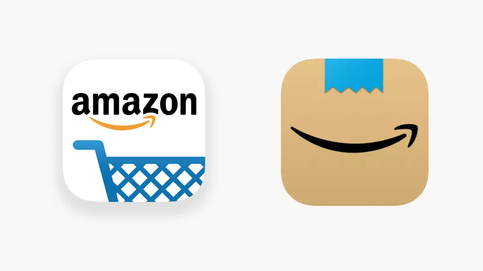
At first glance, there's lots to like about the new icon. By placing the smile, perhaps Amazon's most recognisable visual asset, front and centre, it comes across as a simple yet confident design. It's also bound to stand out on your homescreen. In a sea of overly-minimal logos on white backgrounds (yes, Google, we're talking about you), Amazon's effort is likely to draw your attention. Indeed, none of our best iOS app icons are also based on cardboard.
But while some corners of the internet love the new icon, others have spotted a somewhat unfortunate design flaw – and once you see it, it can never be unseen. It's all about that tiny strip of blue tape at the top of the icon. When placed above the 'smile', it looks a little like a moustache. And not just any moustache, but, according to Twitter, a rather familiar one.
Someone should tell @amazon that a mouth with a little moustache is a big no-go... https://t.co/bqQSDFYhHmJanuary 26, 2021
My parents use Amazon nearly every day. They’re going to be lost for the next few days. When they ask where Amazon’s gone, I’ll tell them to look for the cardboard Hitler… https://t.co/u1YcJUBNSNJanuary 26, 2021
God dammit. I really liked this icon design, but now I’m cursed with this interpretation. https://t.co/8g7TTcQQ5IJanuary 26, 2021
New icon for the Amazon app? This is infinitely more elegant, and a little playful. I love it! pic.twitter.com/gJChQxsDCNJanuary 25, 2021
Amazons new App logo Does not remind me of Hitler... Amazons new App logo Does not remind me of Hitler... Amazons new App logo Does not remind me of Hitler... pic.twitter.com/CAx0kWKeDmJanuary 26, 2021
And with that, this once stylish icon has been forever changed for us. At least it shouldn't be a difficult one to tweak – all Amazon needs to do is add a second strip of tape below the smile – or, better still, remove the tape entirely. If anything, an all-brown icon would look even cleaner.
Still, as these 12 infamous design fails show, Amazon is no means the first company to get into hairy situation, design-wise. And if you fancy changing Amazon's icon yourself, you can – here's how to customise your iOS 14 homescreen icons.
Read more:
"design" - Google News
January 26, 2021 at 07:37PM
https://ift.tt/2Nxznot
Amazon reveals new app icon, but users spot an unfortunate design flaw - Creative Bloq
"design" - Google News
https://ift.tt/2tAY9dw
https://ift.tt/2zaSFZM
Bagikan Berita Ini


0 Response to "Amazon reveals new app icon, but users spot an unfortunate design flaw - Creative Bloq"
Post a Comment